
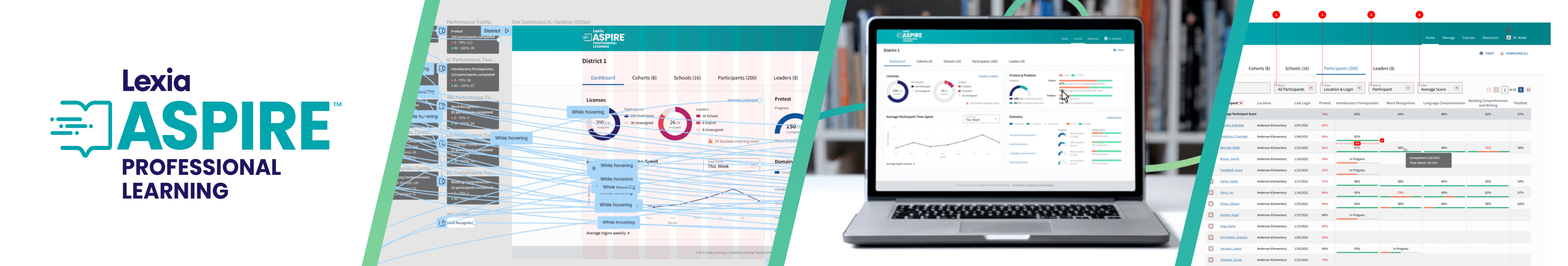
Aspire Professional Learning
For this project, I was tasked with creating the admin (Leader) side of a professional learning platform meant to help K-12 teachers understand the science of reading. Myself and my team went through many rounds of designs, testing and QA to create this product from the ground up, which can now be purchased for use by schools across the US.
Skills: UX Strategy, Prototyping, Visual Design, Branding
Research & Mapping
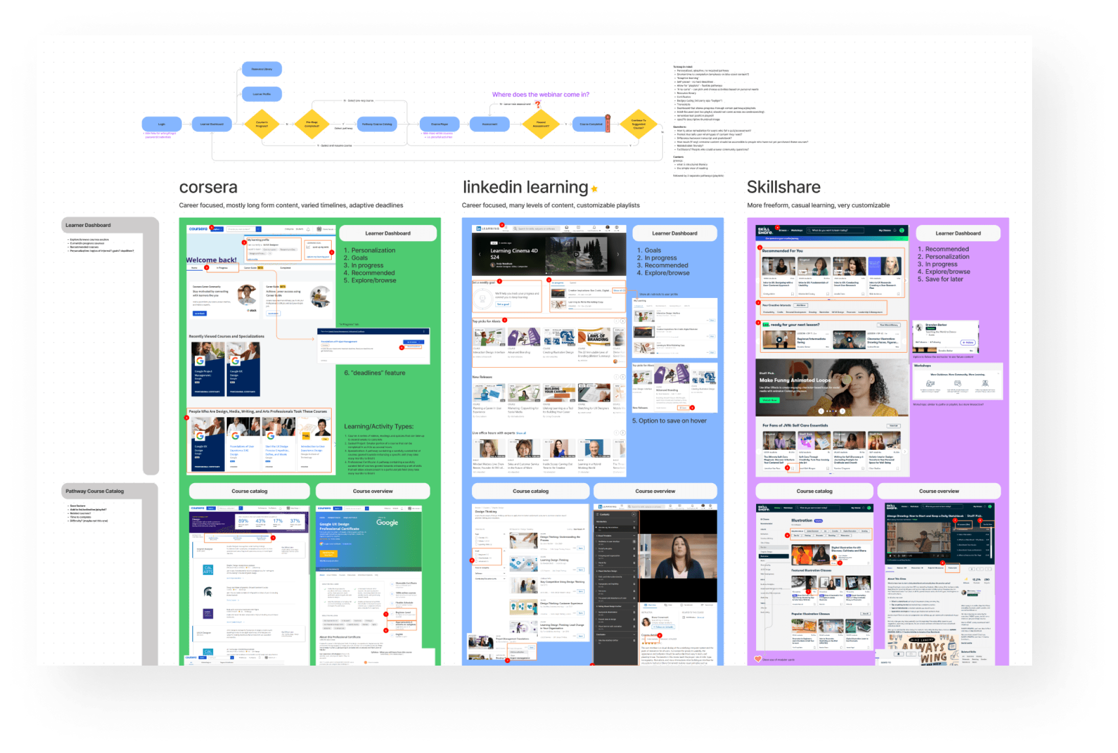
Research exercise: we listed out features we knew we needed and compared existing features from similar products to get a better understanding of the market we would be serving.
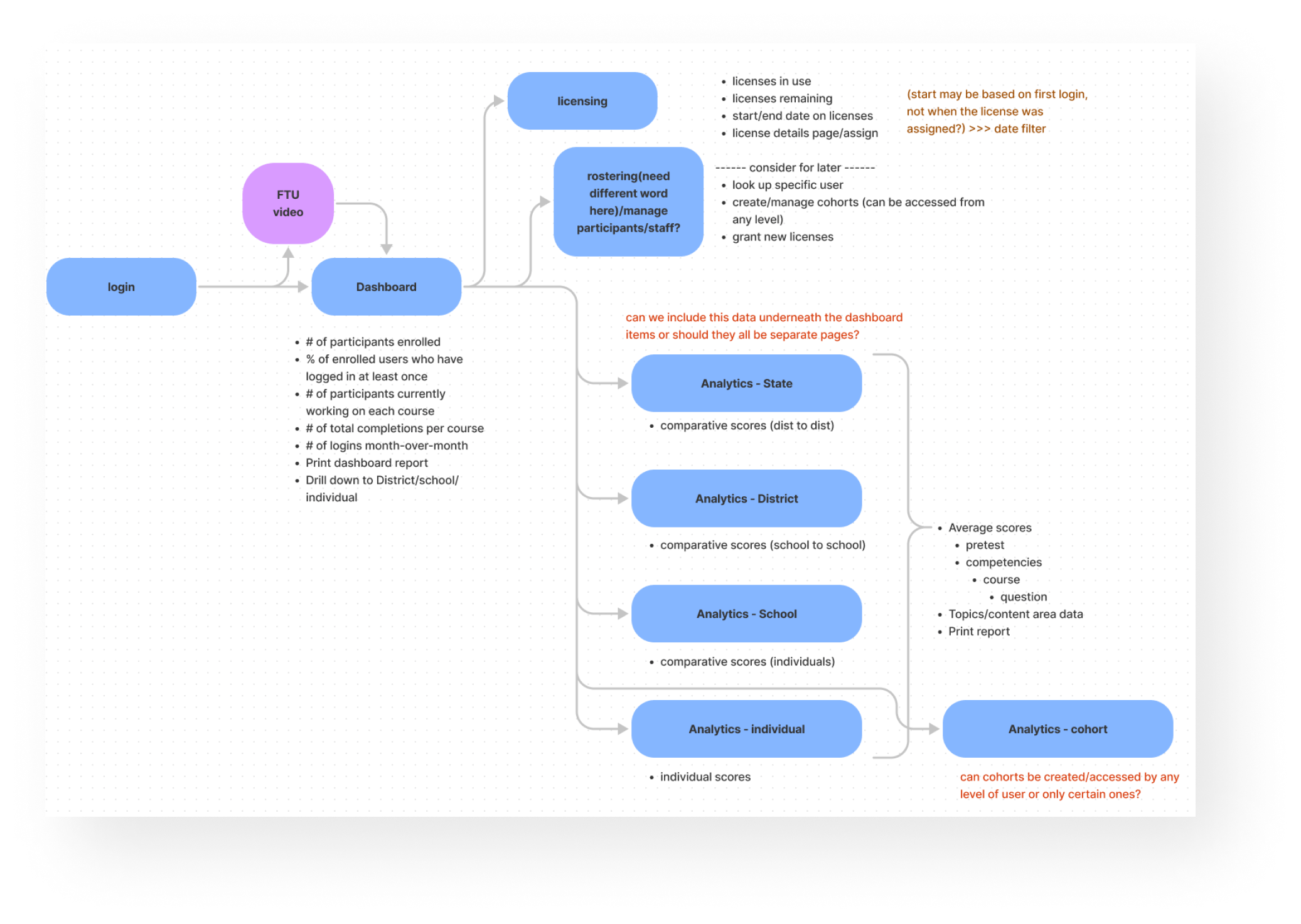
After deciding on a direction for the admin side of the product, this is the feature map I created to outline the basic site structure.
Exploring Data Visualization
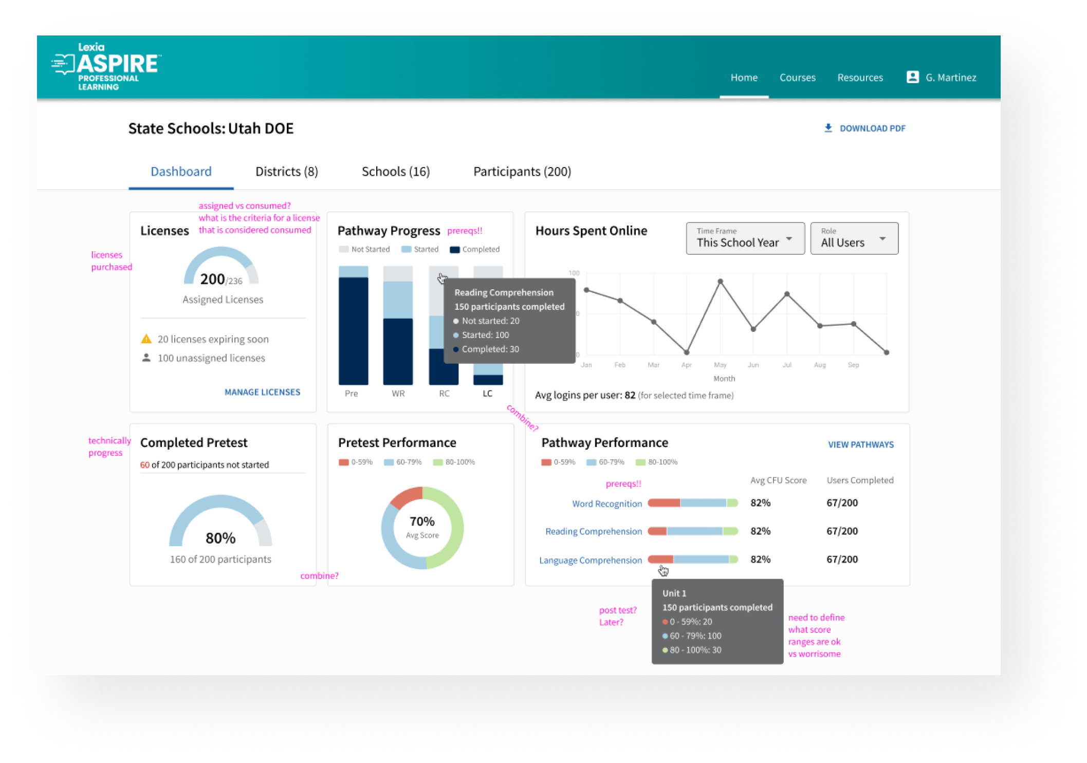
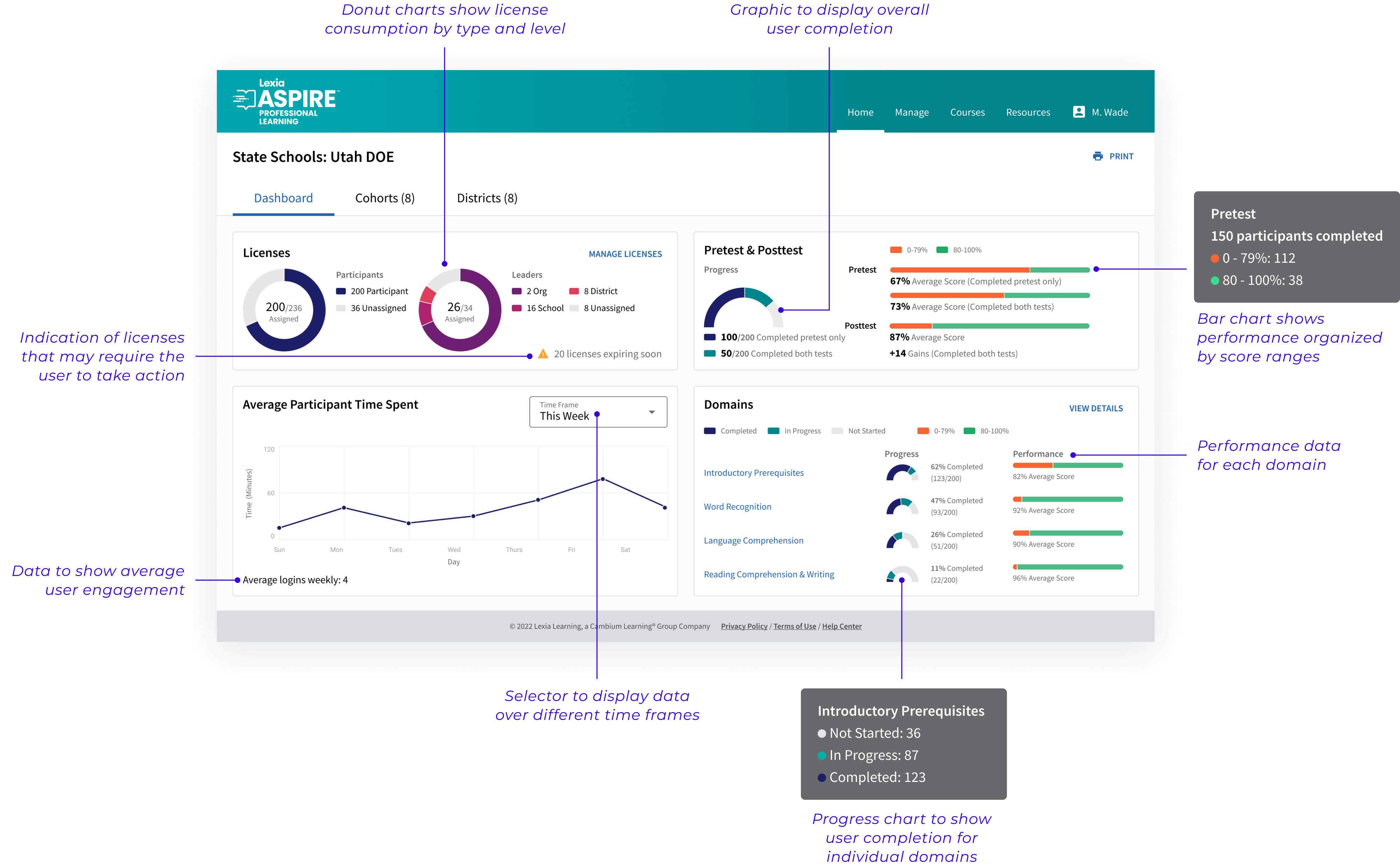
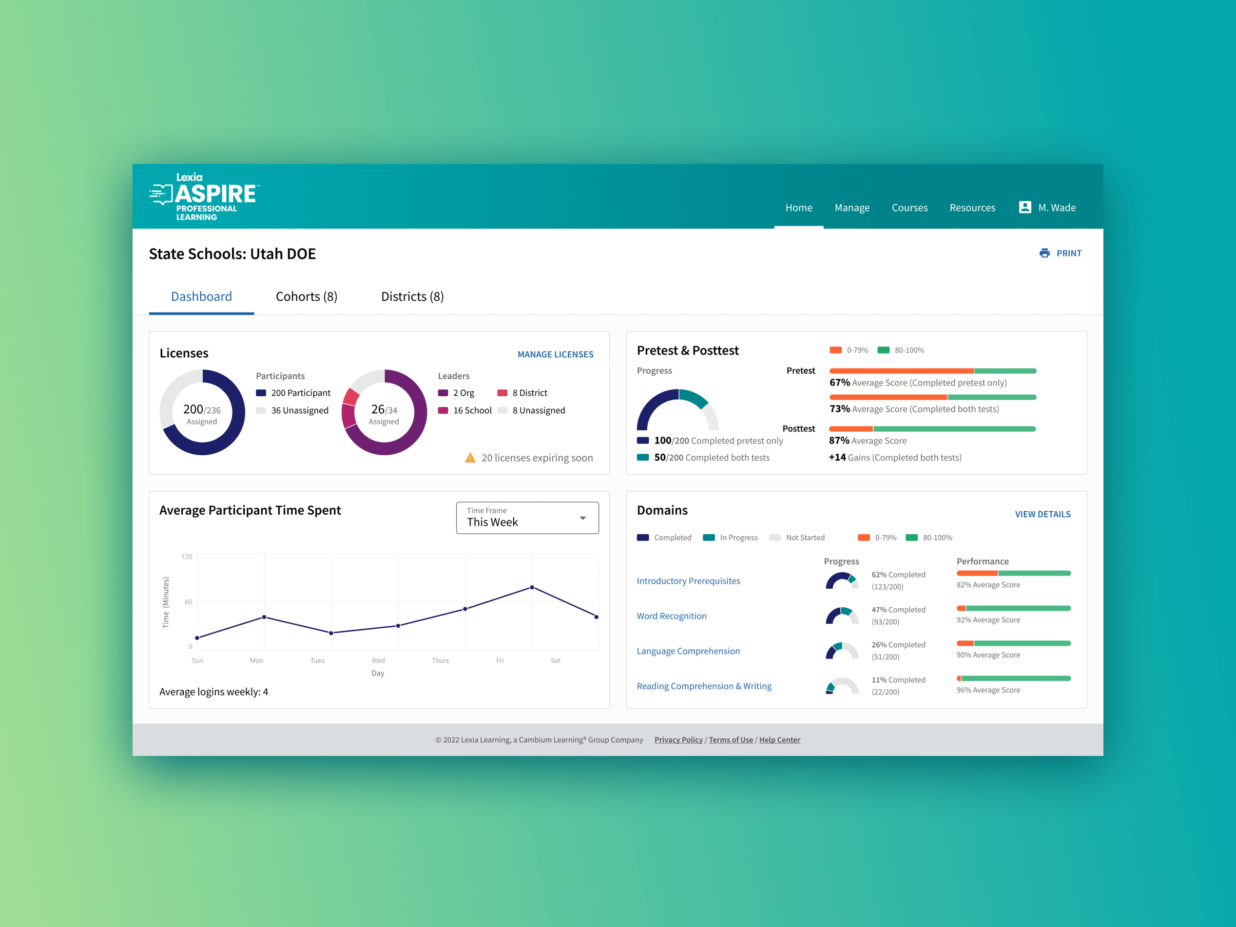
The main feature of the Leader side of the product would be a dashboard displaying a wide variety of high-level information. I tested various methods for displaying license, performance and usage data throughout the product. The challenge was creating visualizations that worked well together while also being easy to understand at a glance.
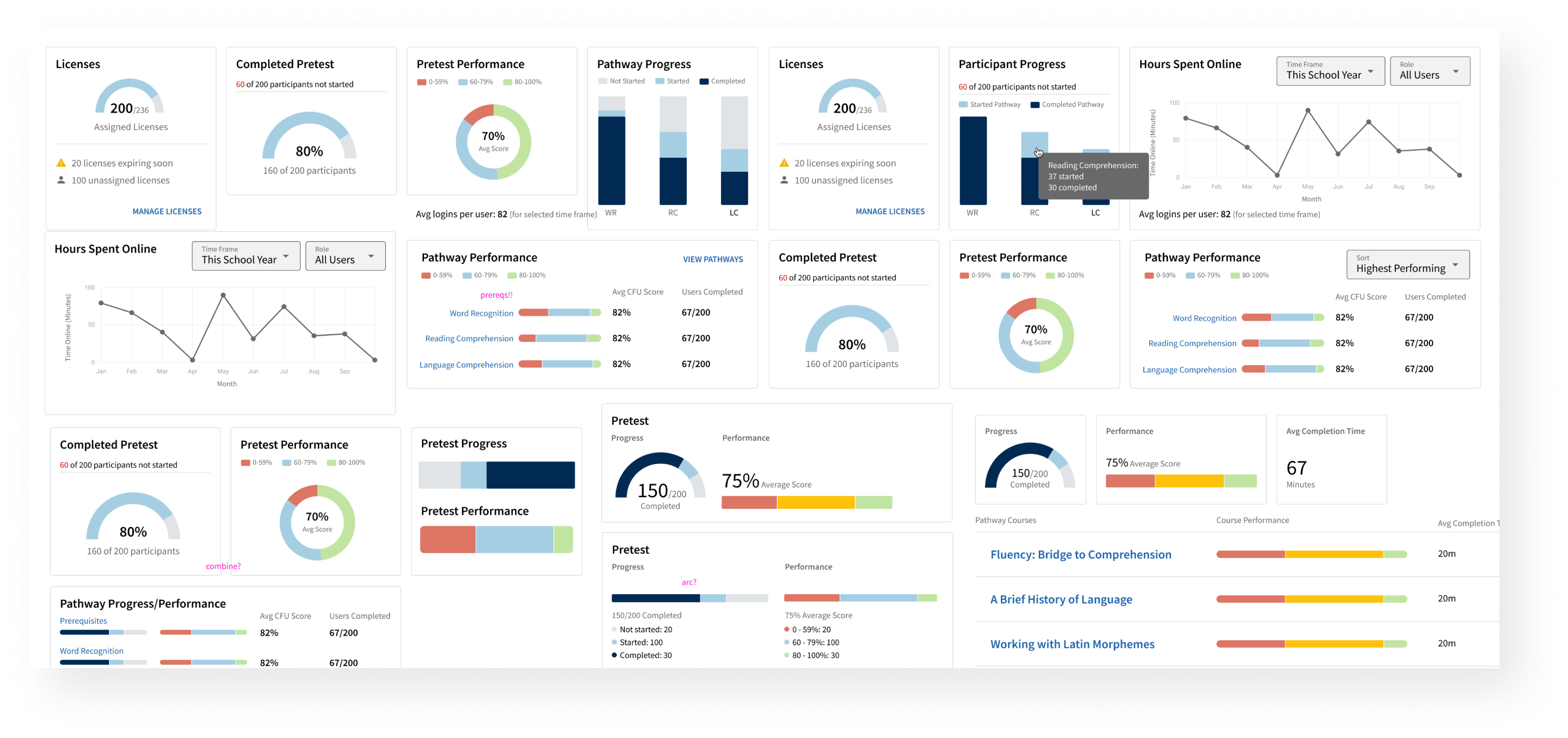
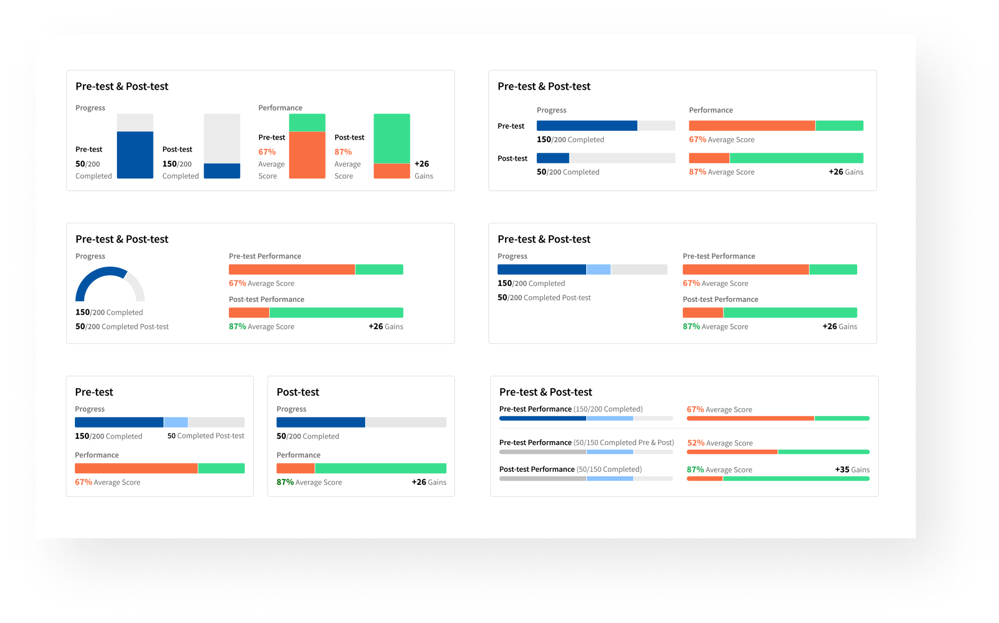
The pretest and posttest widgets specifically required a large set of iterations to land on the best way to display the number of users who had completed each one, user performance, and overall improvement.
Early iterations showed some of the data we would ultimately need, though after many rounds of feedback I ended up combining several of the widgets (the pretest completion and performance for example) and swapping out the charts for ones that recieved more positive user feedback.
Prototypes & Testing
In order to demo the dashboard effectively, I created Figma prototypes to show the functions of the dashboard and some of the reporting pages. This included hover tooltips, chart functions, and linking up the pages to allow the user to "navigate" through the design when testing out the intended flow of the product.
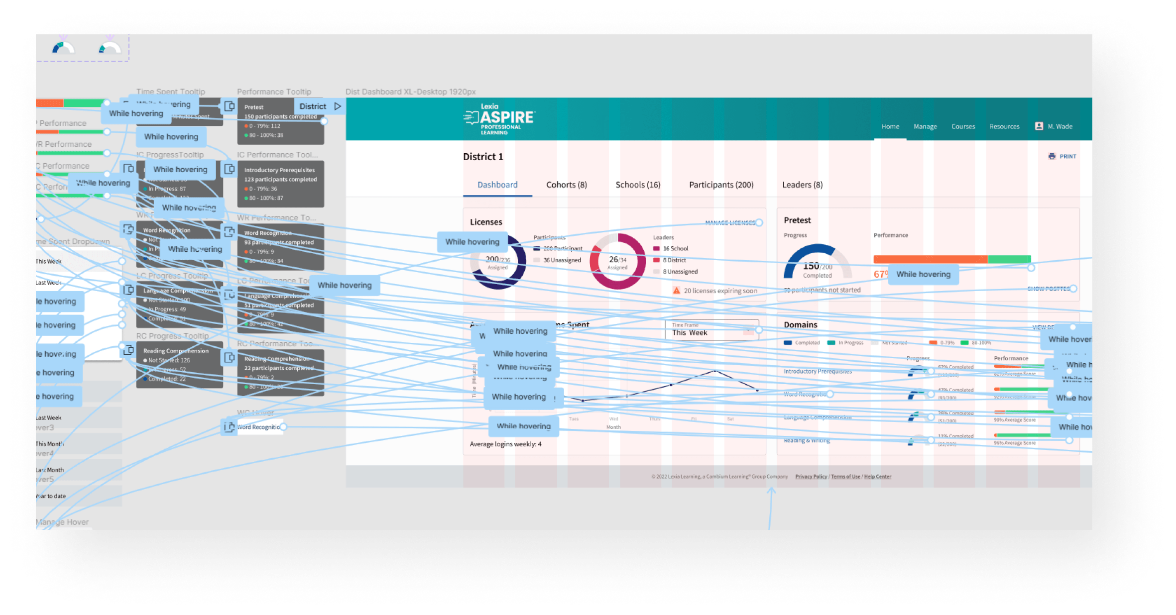
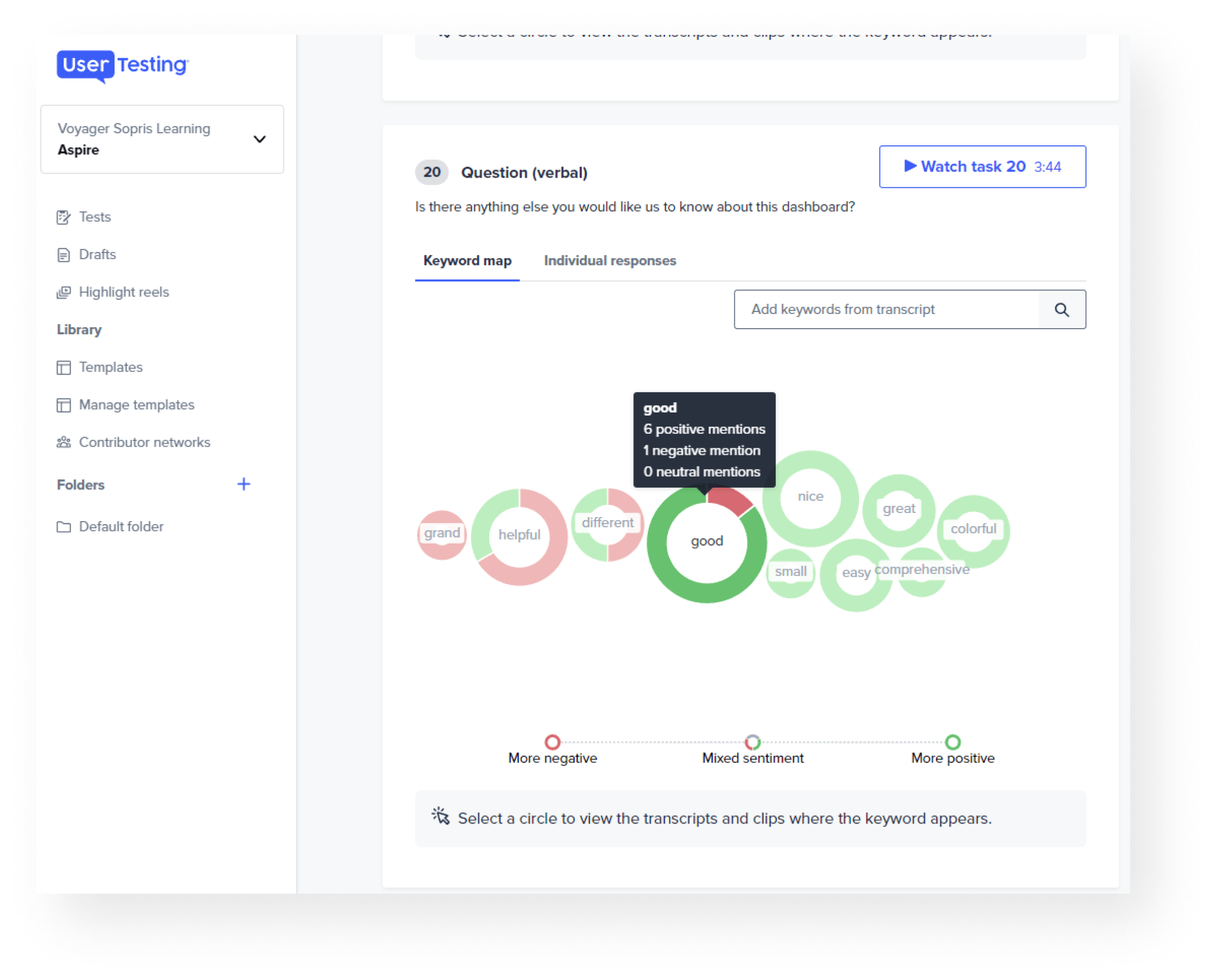
I used Ustertesting.com to test early prototypes of the dashboard and figure out which sections needed improvements or changes. Tests were built to allow users to “navigate” through the product via guided prompts and offer feedback at thier own pace. Usertesting.com offers visualizations like this one to help sort through the data provided afterwards. In this particular test, we found that there was a widget that users did not find helpful, so we ended up changing it significantly leading to better feedback later on.
Final Output: Leader Dashboard
Brainstorming Scannable Tables
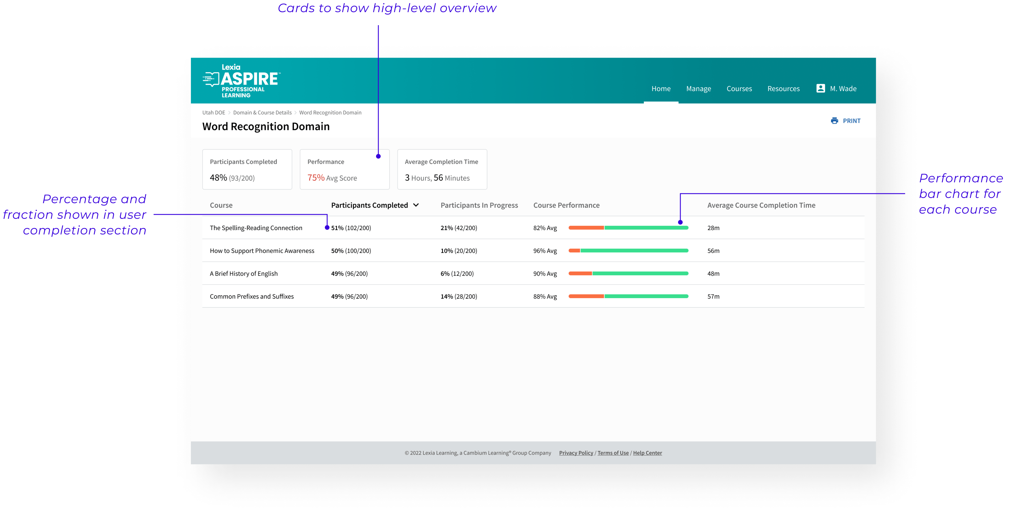
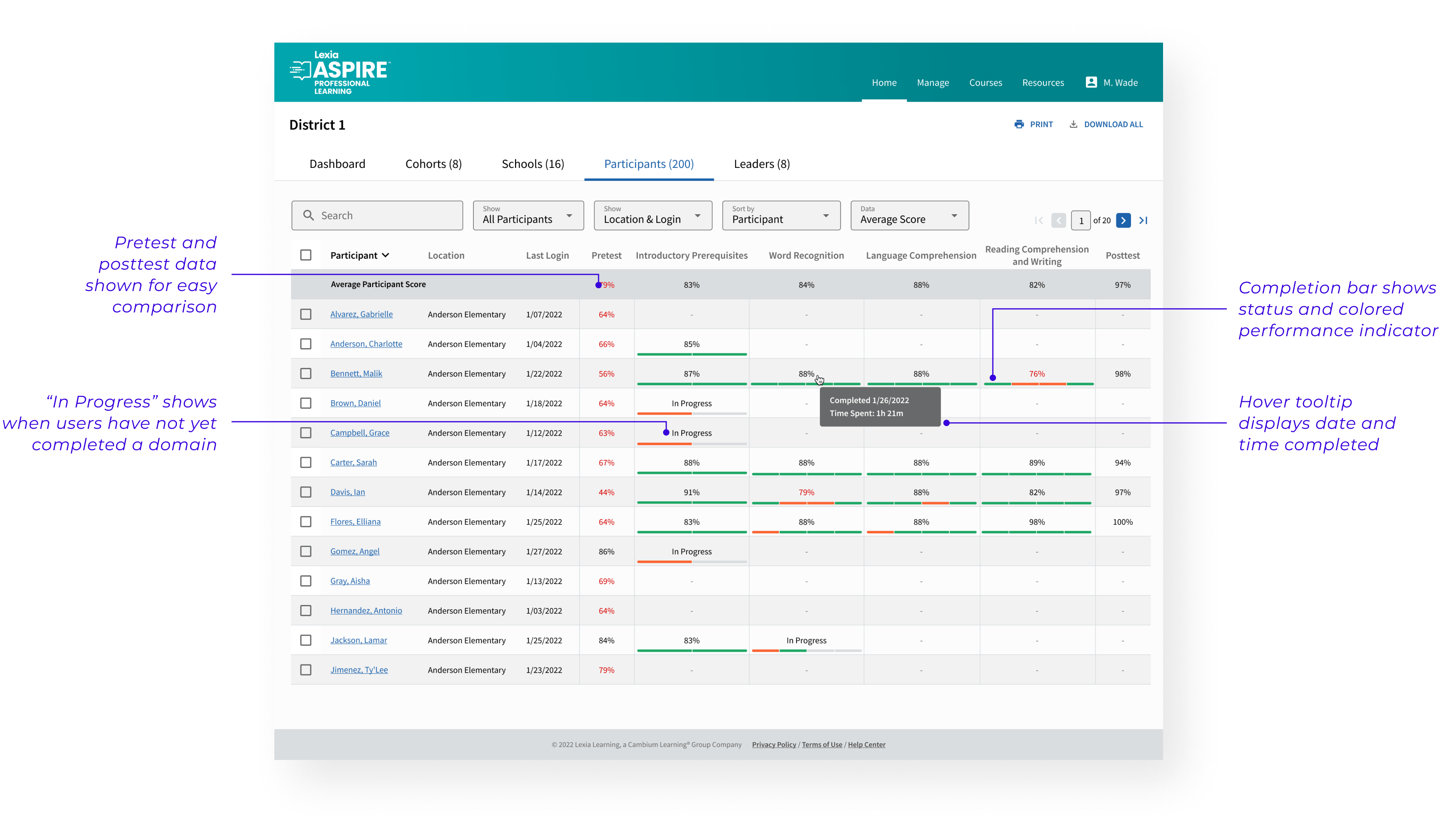
Displaying individual performance information required very dense data sets and took several tries to come up with something that could be scanned easily. The designs we landed on used a specific set of horizontal bars to show completion & performance all at once. This system is used on several pages to ensure consistency in the way we show data throughout the product.
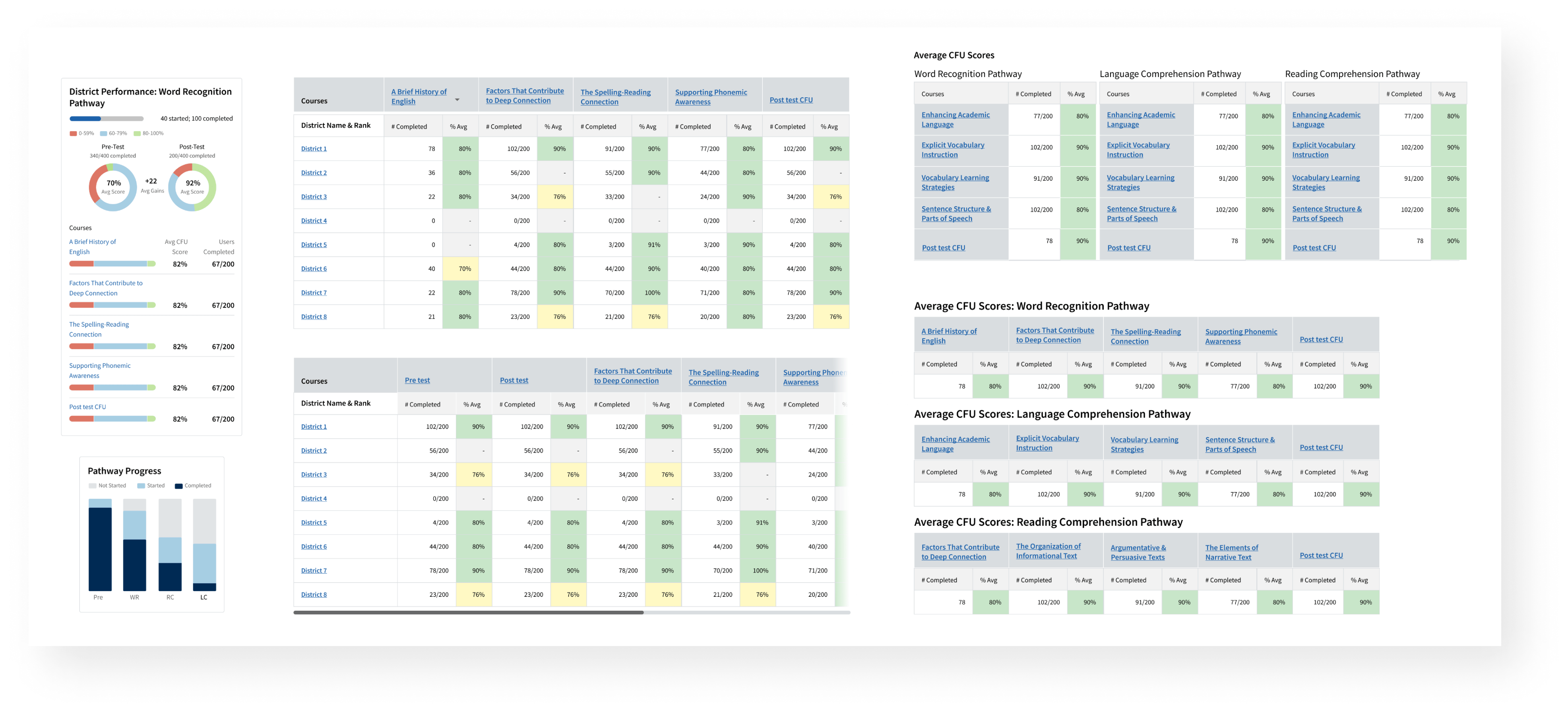
Output: Final Performance Visualizations for Domains Page and Participants Tab
Responsive Design & Dev Handoff
To ensure smooth developer handoff, I created interaction specs for each page that outlined spacing, sizes and component functionality that developers should be aware of when building.
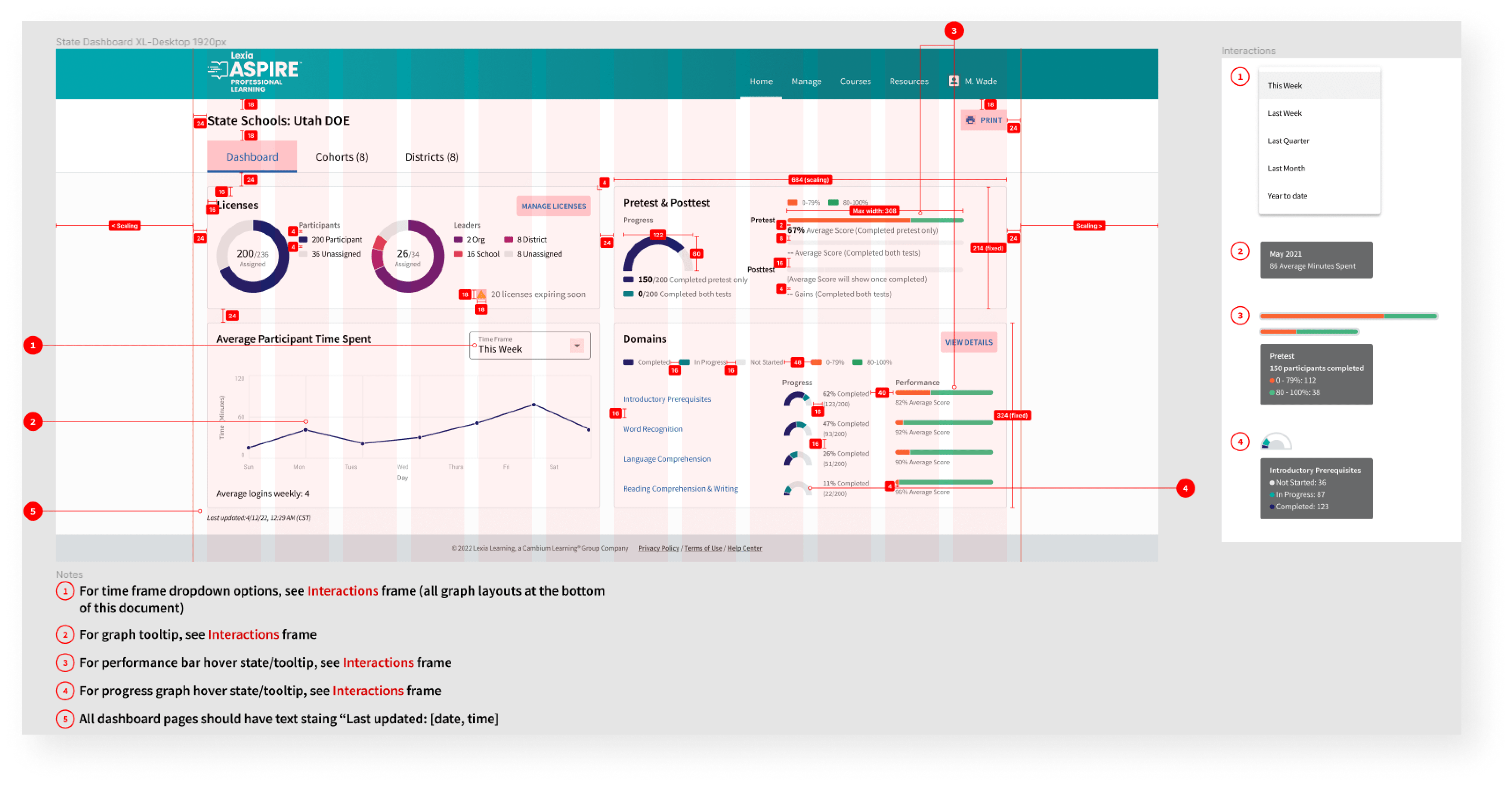
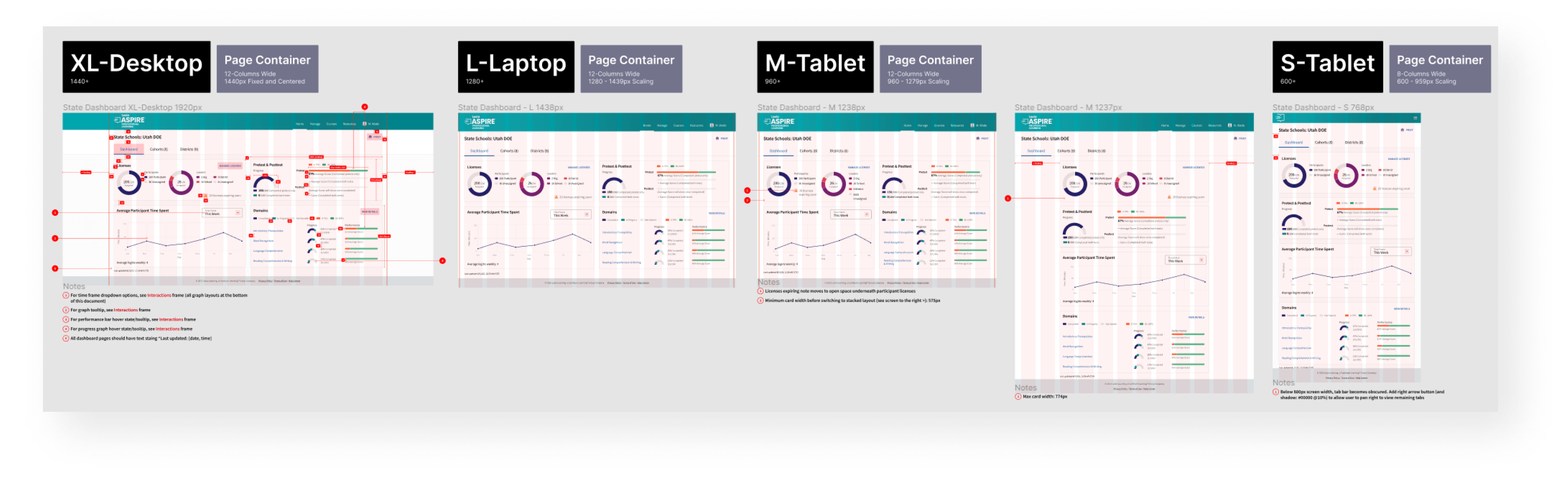
Each page also included a set of responsive designs down to a small tablet size to show how the page would reformat at different breakpoints.
Brand Design
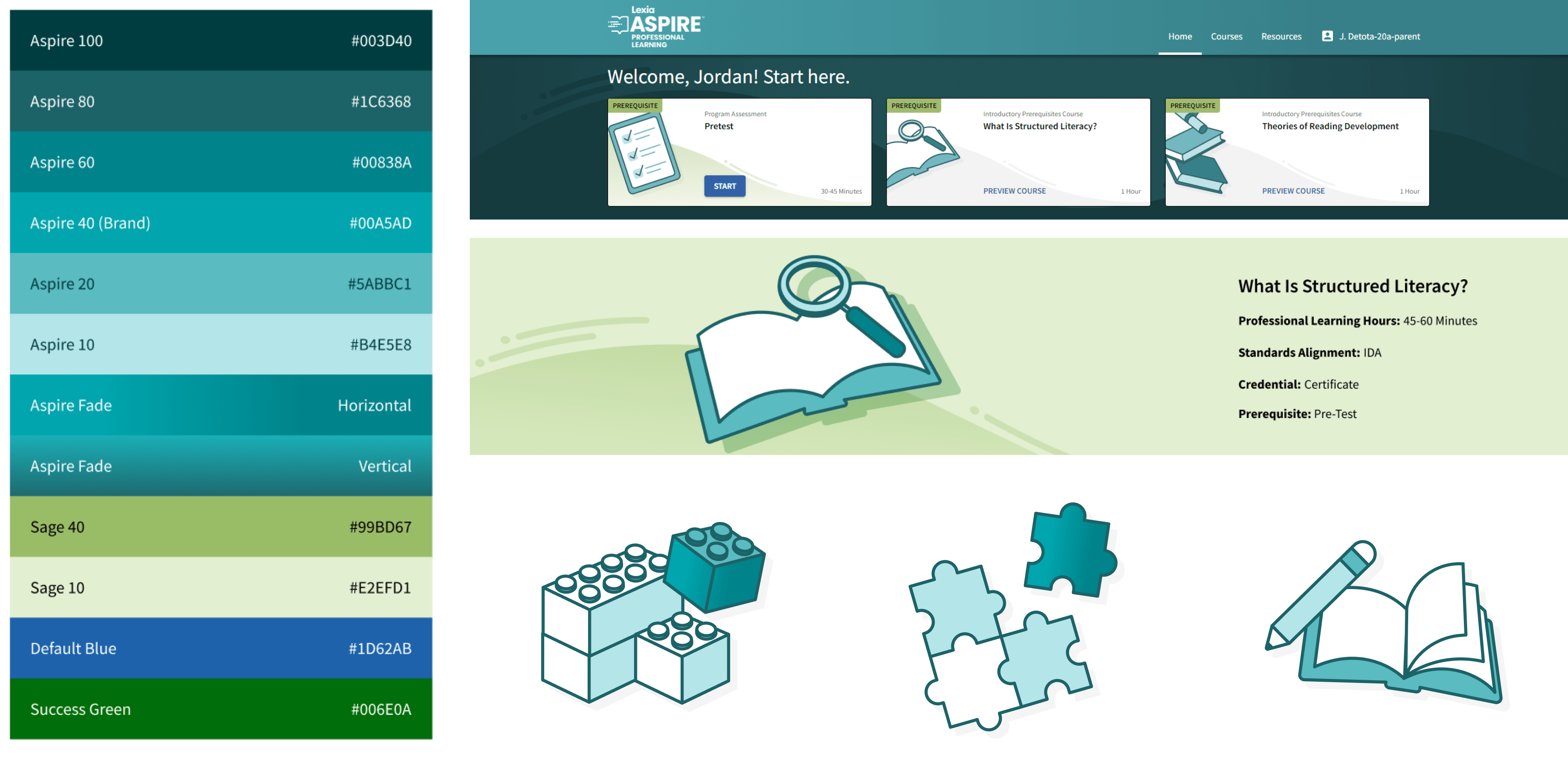
In addition to the Leader side work, I was also tasked with taking the teal color we were given for the product and expanding on it to create some more robust brand guidelines. I created a color palette that brought in some more shades of teal as well as some green and using that palette, I made a set of illustrations that would be used on the participant side to bring some life to the product.
Other Work

Lexia English Conversational AvatarProject Management | UX | Game Design
Lexia Aspire Professional LearningUX | Data Viz | Branding
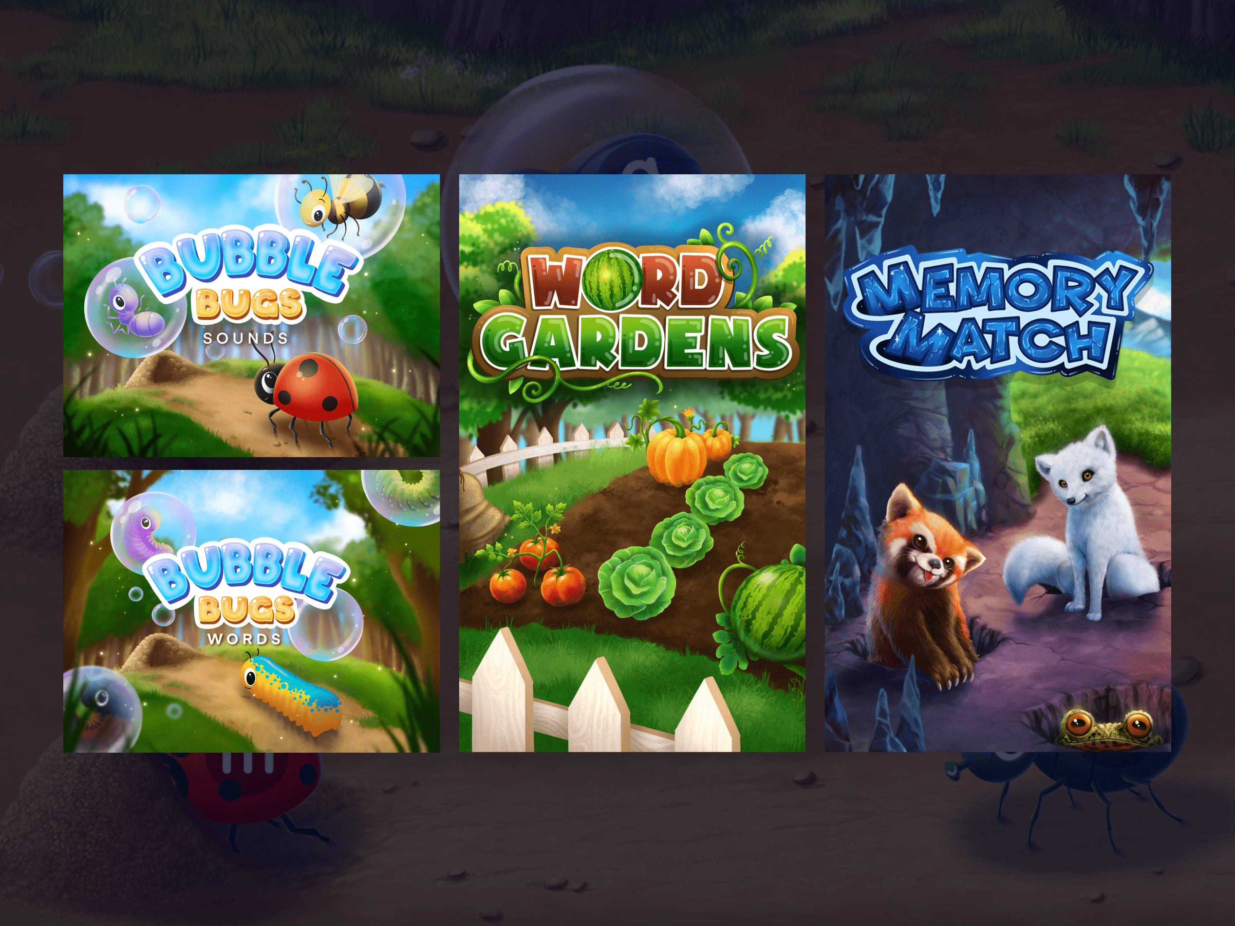
Reading Rangers GamesUX | Art Direction | Game Design
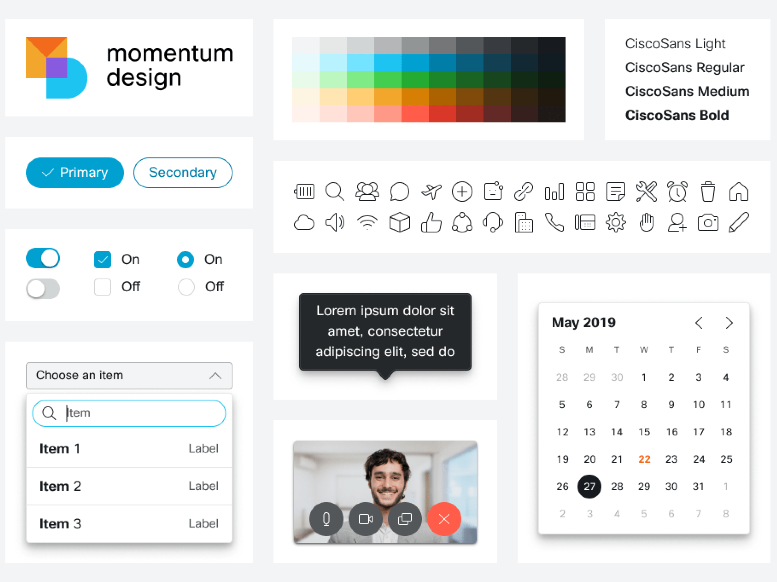
Cisco Webex Design SystemUX | Design Systems | Visual
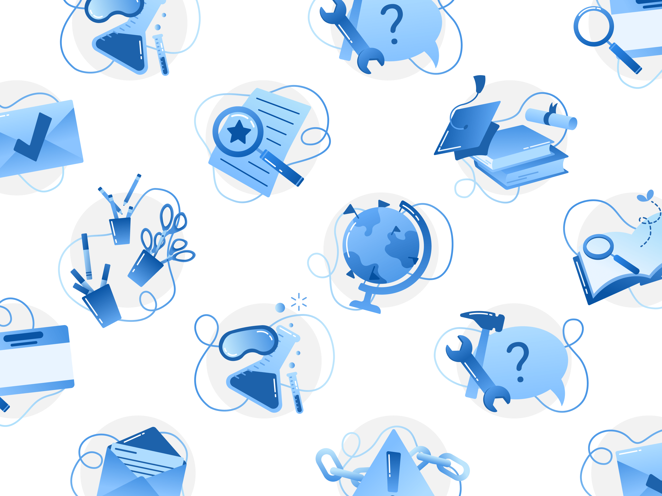
Illustration System WorkDesign Systems | Project Management | Illustration